Synth
Essential framework: The MVP build of a design system, integrating core elements & refining styles for a functional, streamlined, user-centric foundation.


Context:
In designing digital products, a concern of mine has always been trying to connect the dots. As well, design systems interest me, so I decided to build the Synth design system because I feel using a design system can save time in building digital products, while improving production quality. 

I decided to build an MVP design system because I want to find ways to ensure seamless connectivity in the design journey, optimize team collaboration, efficiency, and deliver impactful results swiftly.


My Role:
Ideation & Creation

Duration:
5 Weeks

Tools:
Figma

Team:
Carlos Moore


synth_header.png
 

Where to start?


This project is introduced as an MVP offering, strategically focusing on essential components and styles to swiftly enhance consistency and efficiency. This minimal approach ensures rapid deployment, allowing us as designers to iterate and gather user feedback for continuous improvement and scalability.

Speaking of scalability, it’s a crucial element of any design system. Design systems help in situations where the project might need to expand to accommodate different devices and platforms or when the team is expanding or when trying to accommodate new trends and practices.

Things to consider when planning a design system:

  • Team size

  • Product scope size

  • Need for multiple themes/brands/products

  • Need to duplicate the entire design system (freelancers & agencies)

First things first, below is the file structure I chose when building the Synth MVP. It’s for the designer or organization that has fairly standard needs. The product scope can be anywhere from small to large, and it works well when there’s only one brand (at least for now) and a need to support multiple themes in the future.

 
Synth File Structure

This file structure is for designers/organizations that have fairly standard needs. It allows for the handling of a product scope that’s anywhere from small to large. It’s also recommended if you only have one brand (at least for now) and might need to support multiple themes, now, or in the future.


Gifts & Curses


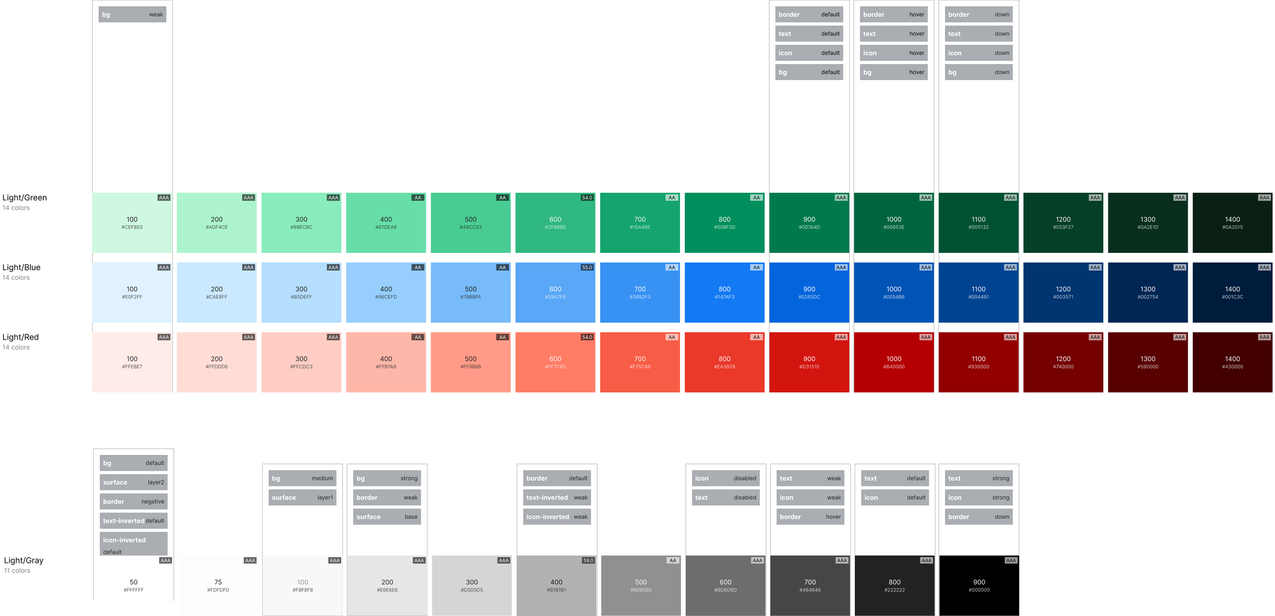
So, after planning the file structure for Synth, it was time to start working on the styles, in which we normally refer to the following as the “foundations” of a design system: colors, typography, spacing, grids, and elevation. While I was excited for this process, there was a drawback - I was essentially piloting a design system - a design system without a specific destination (yet!), so I didn’t want to put an emphasis on selecting the “perfect” color scales or typeface.

When we discuss foundations for design systems, sometimes we can get stuck on identifying the perfect foundational elements before we proceed further. In my opinion, I don’t think it’s necessary to hone in on the perfect colors and typefaces early on because - well, in the words of Dan Mall:

The idea of “foundations” in design system work is a black hole. For systems-minded designers and engineers, the gravitational pull of spending months studying to find a perfectly harmonious set of colors, workhorse type family, data visualization library, or animation suite is near impossible to resist. When done too early, these are self-serving (and often selfish) activities that distract from the real focus of design systems: making it easier and better for feature teams to create things that further the organization’s mission.

A design system is a product, so the process to create an adopted one should resemble the process that startups use to create adopted products: create a minimum viable product to test a particular hypothesis, measure how customers respond, and learn whether to pivot or persevere. Picking primary and secondary colors isn’t a test of any particular hypothesis, not one that matters when you’re first starting anyway.

Spending time on “foundations”reveals its own hypothesis: that an objectively better design system will find traction. That, if the code is cleaner and the design is tighter, designers and engineers will naturally make the wiser choice to use it. Perhaps of any common assumption I’ve seen in design system work, this is the one I’ve found to be the least true.

I was building Synth for utility use, simply because I know I can easily transfer styles over to any design project I’m working on, if that particular project/product doesn’t have an organized set of styles to begin with.


Colors


As designers, we use color to highlight important buttons or calls to action (CTAs), essentially to guide the user's journey more intuitively. Or, we’re using color for brand identity and user perception because color schemes often form an integral part of a brand's identity, influencing how users perceive and interact with a brand.

With Synth, I didn’t want to put a lot of emphasis on designing the ‘perfect’ color scheme. My main focus was to build a design system, acquiring the necessary knowledge to implement said knowledge in real-world scenarios.

I focused on colors for: borders, backgrounds, text, icons, surfaces, & inverted text

While color and text are essential from the beginning, spending too much time thinking about them can be a distraction. For building an MVP, a good recommendation would be to start with a simple color palette and a simple font such as Inter or Roboto for typography.

Of course, as a product grows and branding becomes more important, it would be good to revisit these foundations to better distinguish yourself. Tweaking your colors to be more expressive, adding more tints/shades as the needs arise, or maybe adding some new accents. Having a strong system of color tokens (variables in Figma) will help to update these colors across all your designs, in a quick and easy way.


I selected RGB (reds, greens, and blues), and instead of focusing on which colors to use, I more so focused on how the colors were going to be used, as well as honing in on accessibility, to ensure the colors and text had the right level of contrast to work together effectively.

I then started building the color variables, both primitive and semantic collections. These collections are defined as:

Primitives refer to the very foundational layer of a variable. The name is typically the base-token name, so it is more abstract and non-intuitive in its naming convention. An example of a primitive color would be ‘red-300’. Overall, primitives are not consumed directly by the system’s end users.

Semantics refer to the layer that is shown on components and designs. The name is intuitive and gives context on how the semantic variable should be used. Instead of ‘red-300’, the semantic name could be ‘background-error’ depending on the context of use for that color. Overall, semantics are directly consumed by the system’s end users.


Typography


As designers, we use typography to present our designs and content as clearly and efficiently as possible. In defining typographic styles for Synth, I chose the Inter typeface because it’s a good/safe default option that offers a blend of modernity and readability. Additionally, it provides a solid foundation that allows for further customization of the text styles as the design system continues to evolve and grow.


Components


With thinking about which components to include with Synth, I thought about common components I use, somewhat regularly. A recommendation is that if a component is being used in 3 or more teams, or 3 locations across products, it should be added to a design system.

The idea isn’t to initally load a design system with components that may or may not be used, but to improve the design system as it’s being used because design systems are a tool for scale.

With design systems, the ‘build it, they will come’ concept is a fantasy. I recommend Piloting a design system by way of product work.

It would be great to tie a new design system to a product/project that’s already in motion. Ideally, working with teams to align a new design system with products that have already begun, or products that are slated to begin. Great boarding platforms for a design system are:

  • Rebranding

  • Replatforming

  • A Re-org

  • Content or migration

  • Merging with, or acquiring, another company

These are all points where work is already in motion, so attaching a new design system to one of these platforms helps with efficiency, in that building a design system alongside work that’s already begun is one of the best ways to gain traction.


Specifications


While creating components, it’s imperative to create specifications for all components within a design system because writing component specifications is an investment in the clarity, consistency, and efficiency of the design and development process, ultimately contributing to the success and sustainability of a design system.


What now?


So, now that components have been created and spec’d out, how will new components be added to Synth going forward? The answer - Piloting.

Cycles and feedback loops are important ingredients for any system. With working with design systems, linking product creation with design system growth is the way to go, but how does the cycle start?

This cycle for piloting a design system works in the following way:

  1. Make a feature or product

  2. Extract & abstract components from that feature or product to start the system

  3. Make another product using the components that were extracted in Step 2.

  4. Return to Step 2


Where to from here?


Once the foundational elements have been established for the Synth design system, what’s next? For any design system to grow and thrive, I feel the following next steps should be put in place to help any design system thrive:

  1. Fine-Tuning Together: We should gather around to give our design system a close look. We'll refine and polish it, ensuring it reflects our shared vision and design principles.

  2. Crafting a Story: Documentation - Imagine our design system as a storybook. We're creating documentation that not only guides but also tells the tale of how we design with purpose. A great resource for this is Zeroheight!

  3. Our Users, Our Heroes: It's showtime for user testing! Our users are the heroes of this adventure. Their feedback will shape the final touches, making our design system a true companion in their journeys.

  4. Team Power - Let's Collaborate: Time for team spirit! Through training sessions, we'll ensure everyone is on board and equipped to contribute their talents to our design system.

  5. Harmony in Workflow: It’s time to integrate the design system into the workflow, with a goal of creating a rhythm that makes our work feel awesome.

  6. Unveil Updates: It’s important to communicate updates to a design system, making sure everyone is kept in the know. Let’s ensure everyone is excited about the latest trends.

  7. Accessible to All Stars: Accessibility is our superstar. Let's make sure our design system is not just stylish but also welcoming to everyone, regardless of how they engage with it.

  8. Governance: Establishing a governance model is like having a guardian angel for a design system. It keeps watch, ensuring it thrives and evolves with grace.

  9. Lights, Camera, Launch: It’s time to celebrate its debut and share the spotlight with the entire team.

  10. Cheers to Continuous Improvement: Our design system is a living, breathing creation. With an open feedback loop, we'll keep refining and evolving, ensuring it stays fresh and delightful.